MUSINGS VOL. II

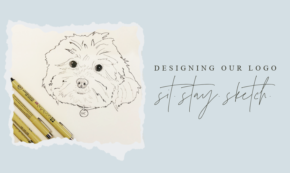
I always knew Hudson Lilly would be the face of our studio, but I really struggled to design a logo that captured her essence and the joy of our brand. For those who are familiar with my illustrations, the people and pets tend to be more life-like, but for our logo, I wanted a caricature that communicated her mischief, intelligence, and sense of style.
It had been weeks of starts and stops, dried micron pens, and crumpled papers. Every sketch became a portrait that lacked the whimsy we needed. I took a few days off to really study Hudson's movements and made a list of everything that made me laugh:
- Right before she misbehaves - tilts her head subtly to the left
- Before she barks - smiles and shows her little lips
- After treats - "nests" by digging her head and front paws into her bed...static ears!
- Shakes until her collar tag faces the right way out, showing her name
- Gets up high to look down at me with a sideways glance before falling asleep
With my notebook beside me, I began to sketch. In less than ten minutes, we had our logo. Every time I seal a delivery with our stickers, I still can't help but laugh!
